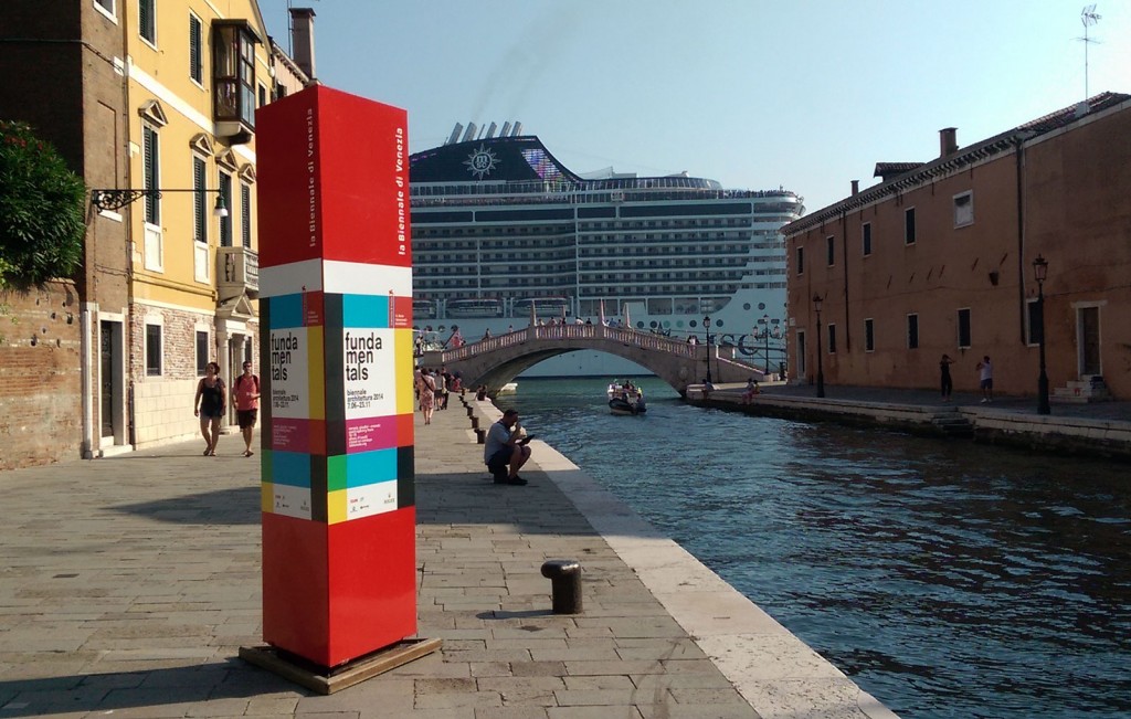
The 14th Venice Architecture Biennale is now one month into its extended six-month run. Rem Koolhaas of the Office of Metropolitan Architecture (OMA) is its curator and with his appointment came two demands, a longer preparation (2 years) and exhibition run (6 months). Koolhaas chose the title, Fundamentals, implying a return or realignment towards a historically-oriented and research-based approach to architecture. His curatorial statements were repeated incessantly that “this biennale is about architecture NOT architects” and “this is a research-based biennale” by pavilions, projects, curators, and official Biennale communications. The first proposition is easy enough to interpret. Koolhaas did not want to promote single architects, which is all-too-often the only theme of an architecture biennale. However, what exactly is a research-based biennale and what form does research take in an exhibition? Does it have its own clearly-defined aesthetic? Koolhaas has never shied away from controversy and for a biennale supposedly not about architects, his name came up in every conversation. His celebrity, starchitect status aside, his practice remains elusive. OMA’s architectural output is often produced by and theorized as using off the shelf ideas and generic models. Making things even more obtuse, OMA even has its own in-house theory, branding, and publishing-wing called AMO. This structure makes both OMA and AMO as difficult to pigeonhole as Koolhaas himself.
Koolhaas remains a divisive figure, larger-than life, prone to bombastic comments yet media shy and thoughtful. He is closely associated with postmodernism and his practice is split between the production of writing and buildings. He has as many enemies as friends and the early reviews of “his” biennale are biting, ad hominem criticisms offering the briefest reflection on the Biennale itself or its contents. Other reviews are of the typical sort of gloss, focusing on sound bites and the prettier highlights of the exhibition.[i]
François Roche’s called Fundamentals obscene, and attacked Koolhaas’ perceived hollowness for the lack of content.[ii]. Kieran Long found “Rem and the Biennale sad”.[iii] Even Peter Eisenman, Koolhaas’ mentor, wanted to steal a little thunder from the Venetian spectacle by declaring that Rem is over and done with architecture[iv] He was at least a little sympathetic to the man himself. It is no surprise that Koolhaas’ critics attempt to deploy the tools and tactics he often uses against others. Despite the criticisms, even its most ardent detractors believed that Fundamentals would be notable for its division of three exhibitions under OMA‘s coordination
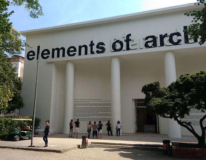
Entrance of the Central Pavilion “Elements of Architecture”
The Central Pavilion is always the responsibility of the main curator. This year the OMA team created the Elements of Architecture by working with a selection of scholars, curators, and a team of Koolhaas’ students from Harvard GSD. The Elements of Architecture disassembles architecture into its supposedly constituent parts—an arbitrary list of pieces like door, window, floor, ramp, façade, and so on. Each element has its own room with its own curator. This large exhibition takes on a curious form, imagine a hybrid of a product catalog and the interactivity of a science museum. The Door room has a wall of door handles designed by architects, models of the gate system used on a medieval castle, and a dissection of the TSA airport security apparatus. Likewise the façade room has a sample of different styles of façade from ceramic tiles, to double glazed glass panels, and LED window screens. The Floor has Persian-rugs, raised modular flooring systems, and a Roomba robot vacuum. Each room is a collection of objects with a loose historical narrative that shows an evolution of both craft and technology and contains an oversized extract from the exhibition catalog describing its contents.
The hands-on interactivity of this exhibition is well-received. It allows visitors to touch, walk on, and try out many things. But some rooms feel like merely a collection of fetish objects—a taxonomy of forms Although volumes of research went into Elements, the installations looked rushed and message is inconsistent. Each room is labeled with contributors, yet it is unclear who is responsible for each component. The “sponsors” of each room who donated their products also appear on the wall texts. Its challenging to disentangle the various voices and perspectives presented in the Elements of Architecture.
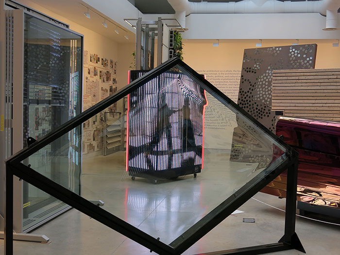
Facades “Elements of Architecture”
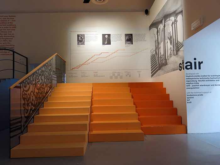
Stair Room “Elements of Architecture”
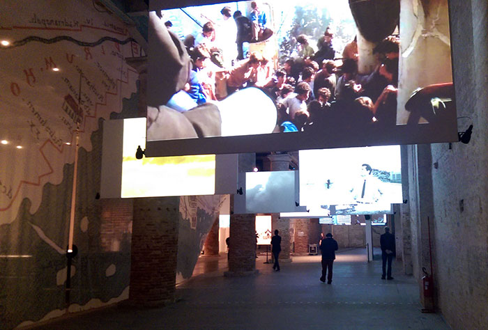
The second component of Fundamentals is Monditalia, taking over the Corderie Building of the Arsenale. OMA’s “scan” of Italy involves the display of forty-one different architectural research projects tracing themes of housing, immigration, religion, media, sex, and politics. Italy is represented through these projects, but the project themes also resonate with contemporary issues faced globally. Monditalia also was asked to incorporate the Biennale Foundation’s other festivals of film, dance, theatre, and music that happen throughout the summer. To achieve this integration, four stages for performers were placed strategically amongst the research displays throughout the building and for the run of the exhibition performers will be using these stages for daily rehearsals. The entire space was also wrapped and subdivided by a curtain with a famous 5th century map of Italy.
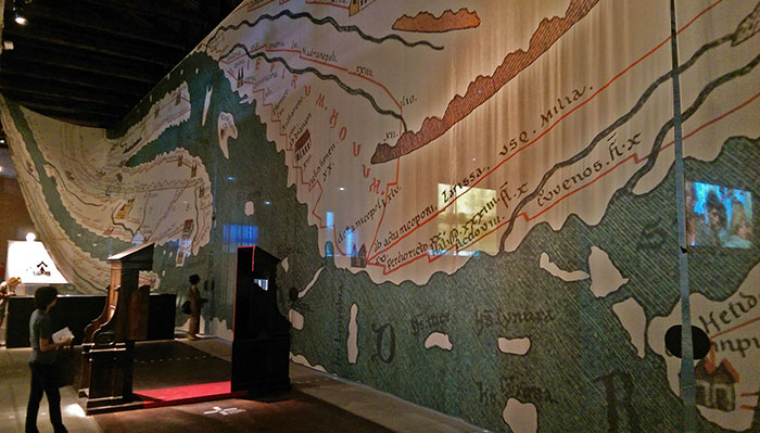
Curtain Map dividing the spaces of the Corderie, Monditalia
The projects in Monditalia vary widely in quality and execution, but there are many standouts. Notable are Armin Linke’s Alpi, Andreas Jacques’ award-winning Milano 2, and Italian Limes—a machine that redraws Italy’s northern alpine border as it geologically shifts in real-time. There were three projects that focused on nightclubs and cultural transformation. Other themes included labor, immigration, tourism, terrorism, the mafia, failed building projects, and radical architecture schools. The display styles varied from simple wall text and photography, to multimedia installations, to oversized prints and number of video projections. Radical Pedagogies had an augmented reality app that would animate their wall of books and information boards. The meaningful connection between the research projects and the performance was tenuous, but the performances offer a different type of engagement for viewers overwhelmed by the amount of information on display.
The third component of Fundamentals is “Absorbing Modernity: 1914-2014.” OMA asked the national pavilions to address on how Modernity impacted each countries architecture. The prompt helped to generate a more cohesive result from the pavilions as they rose to Koolhaas’ challenge. Rarely has a curator has given the national pavilions a theme, and yet this was possibly the strongest part of the Biennale. Many curators responded conservatively by exhibiting an encyclopedic timeline of projects from their respective countries. Others were more complex like Chile’s Monolith Controversies which took a strong concept and clear aesthetic to effectively communicate their contribution. The award-wining pavilions were conceptually strong (Russia, Chile), addressed specifically the themes of the curators (France, Canada) or asked timely questions (Korea). Some pavilions emphasized their relationship to other countries through architectural exports, while others highlighted previously unacknowledged tendencies within their national architectures.
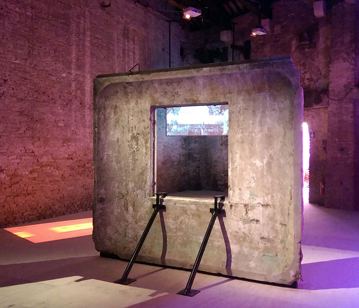
Chile’s “Monolith Controversies” winner of the Silver Lion for National Pavilions
These three components of Fundamentals tailor themselves to OMA’s theoretical orientation. The exhibitions highlight the current tensions between universal modern culture and specific national histories, generic forms versus vernacular forms, post-modern cynicism versus progressive modernity. National boundaries are pulled tight and dissolved, disciplinary assumptions over what is architecture are underlined and undermined. Although it may sound diffuse, the strategy of “overload” almost works in this context. More concerning is the unspoken post-political notion of collectivity and citizenship which tries smooth over tensions in this sticky blanket of research architecture—a gesture that critics no doubt see as hollow.
Will this exhibition change the culture of architecture or architectural discourse? No, probably not. Fundamentals lacks a directed project, it is more of a collection of ideas, forms, and histories. Koolhaas celebrates certain regional modernisms and warns of the creeping digital regime of surveillance but does little beyond that. The critics have long left Venice, having enjoyed their canal-side prosecco, and are now waiting for the next attraction. However, the space is now open to deeper reflection and ongoing research by participants should they be inspired to inquire further.
Will this bigger-is-better gambit change the Biennale Foundation’s approach to producing the Venice Architecture Biennale? It is hard to say but one important metric is attendance. In the first month, the turnout appeared low. The Biennale desires to have 300,000 visitors over the course of its exhibition run. Despite the flurry of the first three days, many of the venues felt empty after Vernissage. Organizers have stated that under 200,000 would look pretty bad which means that on average there would need to be close to 2,000 visitors a day to be satisfied. Like any large exhibition, it has its strengths, weaknesses, highlights, and clear mistakes. Even for the Venice Biennale, Fundamentals was guided by an ambitious curatorial strategy that yielded and may still yield unexpected results.
NOTES
[i] “Rem Koolhaas Is Not a Starchitect” W Magazine
[ii] “Obscenity” F Roche
[iii] “Elements makes you unutterably sad for Koolhaas and what he thinks architecture is” Kieran Long, Dezeen
[iv] “Rem Koolhaas is stating “the end” of his career, says Peter Eisenman” Dezeen
